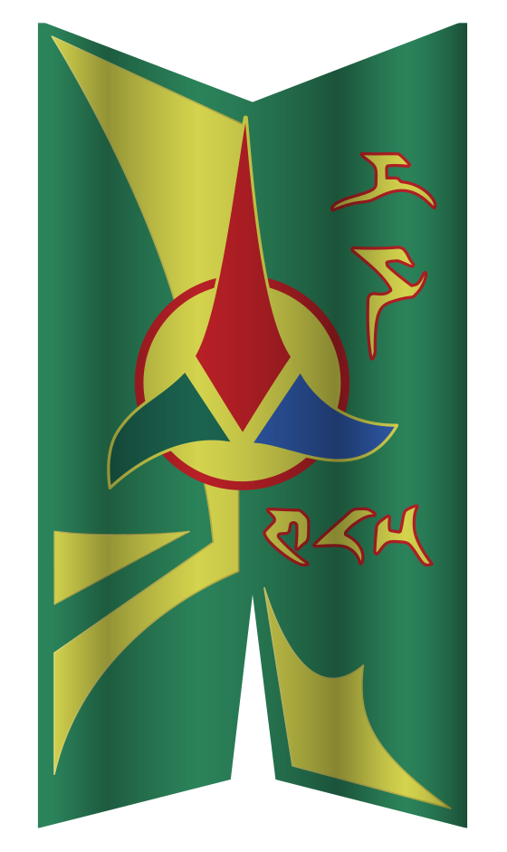
This is a gathering of notes in preparation for a future project to design a
new pIqaD font for writing Klingon. The purpose of the font is to
preserve (regain?) the look and feel of signage in the various Star Trek
series, yet also imbue them with meaning by allowing that they be written
in proper Klingon.
/zrajm,
This page is a place where I’m gathering ideas and guiding principles
for Teh Ultimate Klingon pIqaD typeface. This will be the dense,
spiky writing you remember from The Next Generation and Deep Space
Nine, but imbued with actual Klingon meaning, with crisp details and sharp
points (rather than the slightly amorphous shapes of the veS QonoS
interpretation).
In short, this typeface will change future history as we know
it!—Retroactively.
j
a
b
l
ch
m
D
e
i
gh
H
I
j
e
l
m
f
n
l
ng
o
p
q
Q
g
r
S
t
tlh
u
h
v
n
w
m
y
’
0
1
2
3
4
5
6
7
8
9
,;:
.!?
c
A sketch of the new, prettier pIqaD. Slashed background indicate undecided glyphs.
(The Star Trek Pi glyph k
is not used here.)
a
b
ch
D
e
gh
H
I
j
l
m
n
ng
o
p
q
Q
r
S
t
tlh
u
v
w
y
’
0
1
2
3
4
5
6
7
8
9
,;:
.!?
Best currently available pIqaD. Symbols from Klingonska Akademien’s pIqaD.
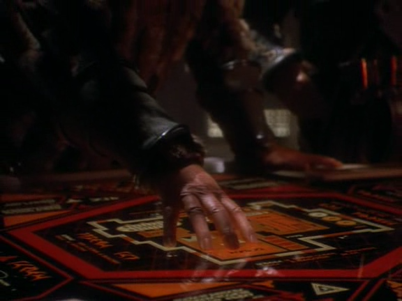
In Star Trek
Klingon signage, as seen in the various incarnations of Star Trek,
used to be devoid of linguistic content. From the very beginning, however,
there existed distinct Klingon visual style, and written text seen
in The Next Generation and Deep Space Nine may have been
nonsense, but it was easily recognizable as clearly Klingon, and consisted of a
small distinct set of characters arranged to form “words”. None of these
characters had sound or meaning assigned to them.
TOS “Elaan of Troyius” (1968): This very first glimpse of written
Klingon actually predates the spoken language by quite a number of years, and
comes in the shape of hull markings on a Klingon warship. Unfortunately the
characters are not legible on screen, but behind-the-scene photos of the model
used for filming the episodes, as well as design notes by Matt Jefferies show
us what they look like (Star Trek Sketchbook: The Original Series,
1997; The
Evolution of the Klingon Emblem,
2023; Smithsonian:
Model, D7 Klingon Battle Cruiser, “Star
Trek”; Forgotten
Trek: Designing the Klingon Battle Cruiser, 2005):
The characters can be read as “D74” using Klin Mura character set
(below). Whether or this reading is the original
intent—the ship is a “D7-class battle cruiser”—or a retcon is harder to tell,
as the D7 designation was not used in the original series (nor given the Matt
Jefferies’ original notes as published in Star Trek Sketchbook).
Looking at the characters one by one, and comparing them to the now commonly
used pIqaD we find that the first character doesn’t resemble anything at
all, while the second character might be said to resemble an m
and the third definitely look like the number 4. Also, the look of the
characters line up more with the Mandel character sets
than pIqaD.
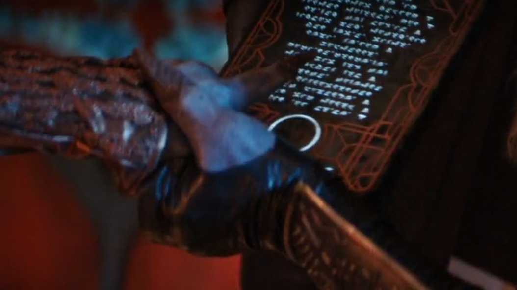
Star Trek: The Motion Picture (1979): The Klingon battle cruiser
from the original series returns, but, since finer details where discernible on
the big screen, a new model with more intricate surface detailing was created.
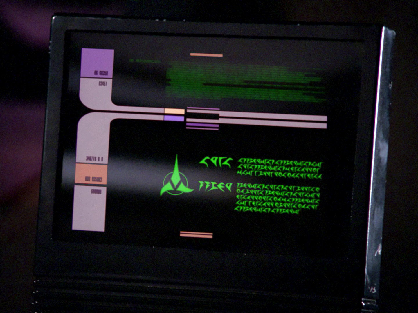
We also see Klingon characters used on various displays in the interior shots
of the Klingon bridge.
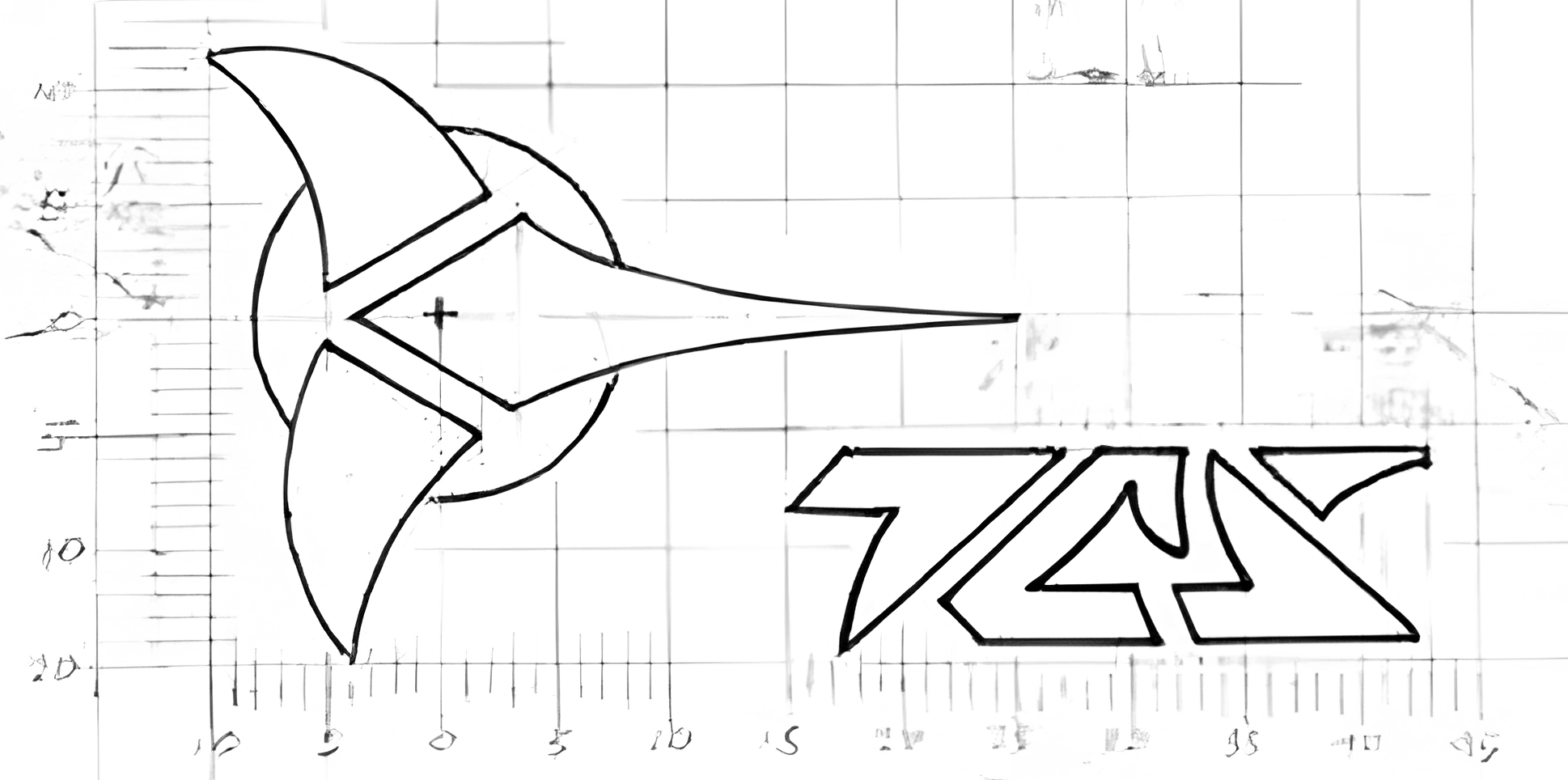
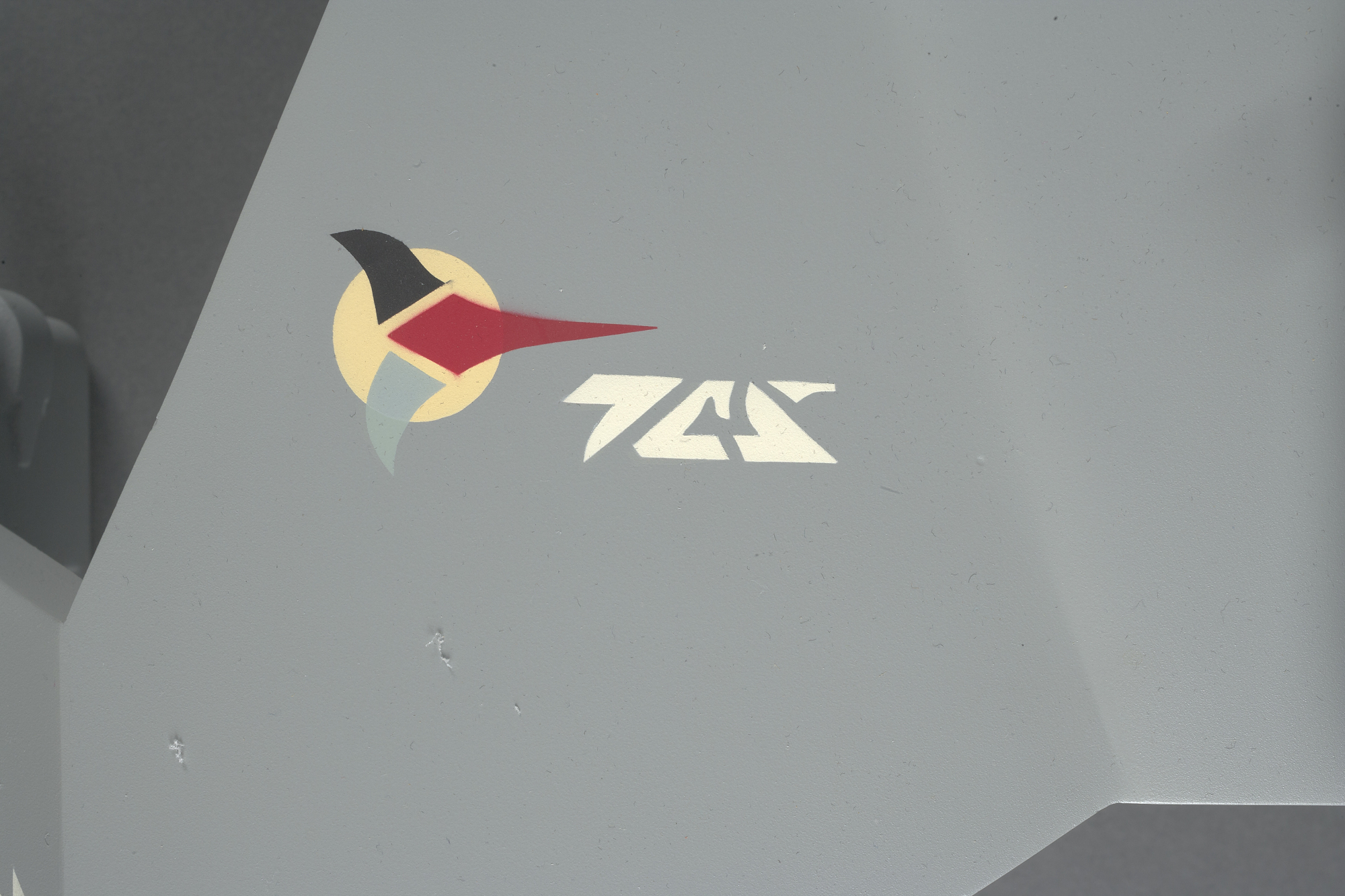
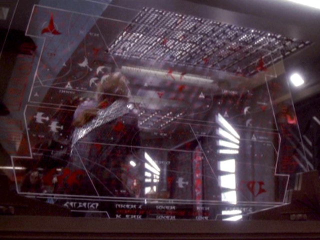
A display on the Klingon bridge (the glyph at the end of the first word is
unique to this movie. (Star Trek: The Motion Picture, 1979)
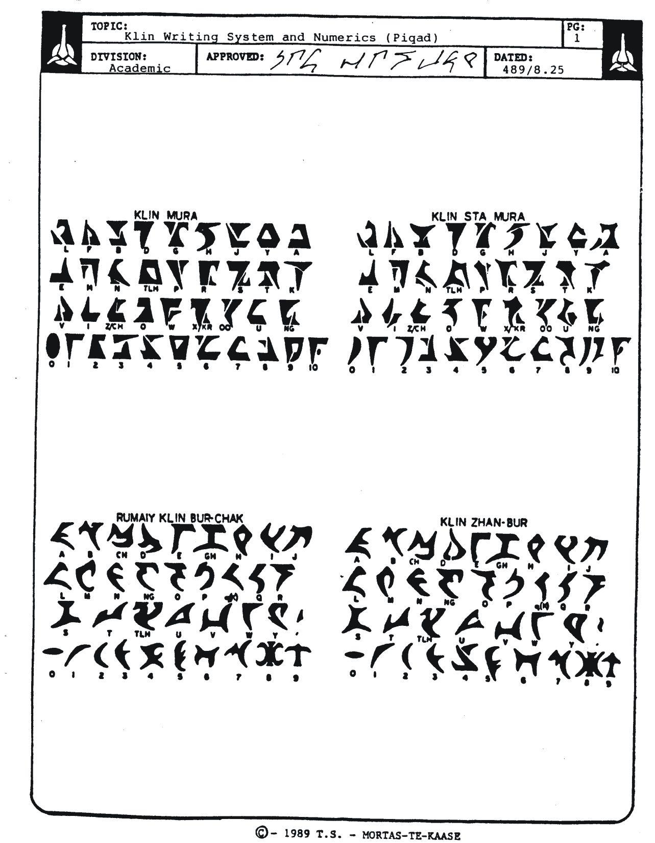
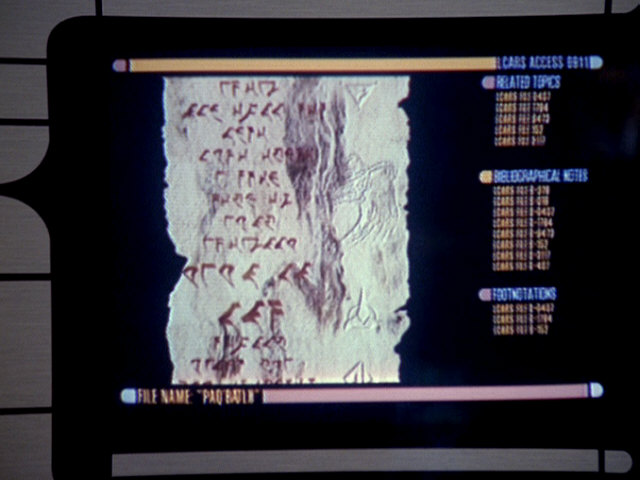
The pIqaD characters we use for writing Klingon were first revealed
in 1989, in the newsletter veS QonoS (“War Journal”) of the now
defunct Klingon fan group Mortas-Te-Kaase. The illustration in veS
QonoS contains two sets
of Mandel characters,
as well as two slightly different versions of pIqaD (labeled Rumaiy
Klin Bur-Chak and Klin Zhan-Bur) and a handwritten signature (at the
top of the page) also in pIqaD.—For rest of this article I’ll only be
discussing the pIqaD character sets (ignoring the Mandel sets), and,
unless specifically noted, it is the Klin Zhan-Bur characters I’m
talking about (since, over time, these alone has come to be regarded as the
official writing system of the Klingons).
In the nineties, The Klingon Language Institute (KLI) made a floppy
disk with a couple of different Klingon fonts available for purchase. One of
these fonts was
the KLI pIqaDmey,
created in 1992 by Lawrence M. Schoen (the founder and, at the time, director
of KLI). KLI pIqaDmey contained the Klingon letters and numbers
(though no punctuation marks, as these only appeared later). The glyphs in this
font are faithful reproductions of those found in veS QonoS, and have
become the de-facto standard for the appearance of pIqaD.
a
b
ch
D
e
gh
H
I
j
l
m
n
ng
o
p
q
Q
r
S
t
tlh
u
v
w
y
’
0
1
2
3
4
5
6
7
8
9
The glyphs of the font KLI pIqaDmey (Lawrence M. Schoen,
1992).
A
a
B
b
D
d
E
e
F
f
G
g
H
h
I
i
J
j
K
k
L
l
M
m
Q
n
N
ng
O
o
C
oo
P
p
R
r
S
s
T
t
U
u
V
v
W
w
X
x
Y
y
Z
z
0
0
1
1
2
2
3
3
4
4
5
5
6
6
7
7
8
8
9
9
The glyphs of the Mandel alphabet
(for English, there’s a separate set for Klingon).
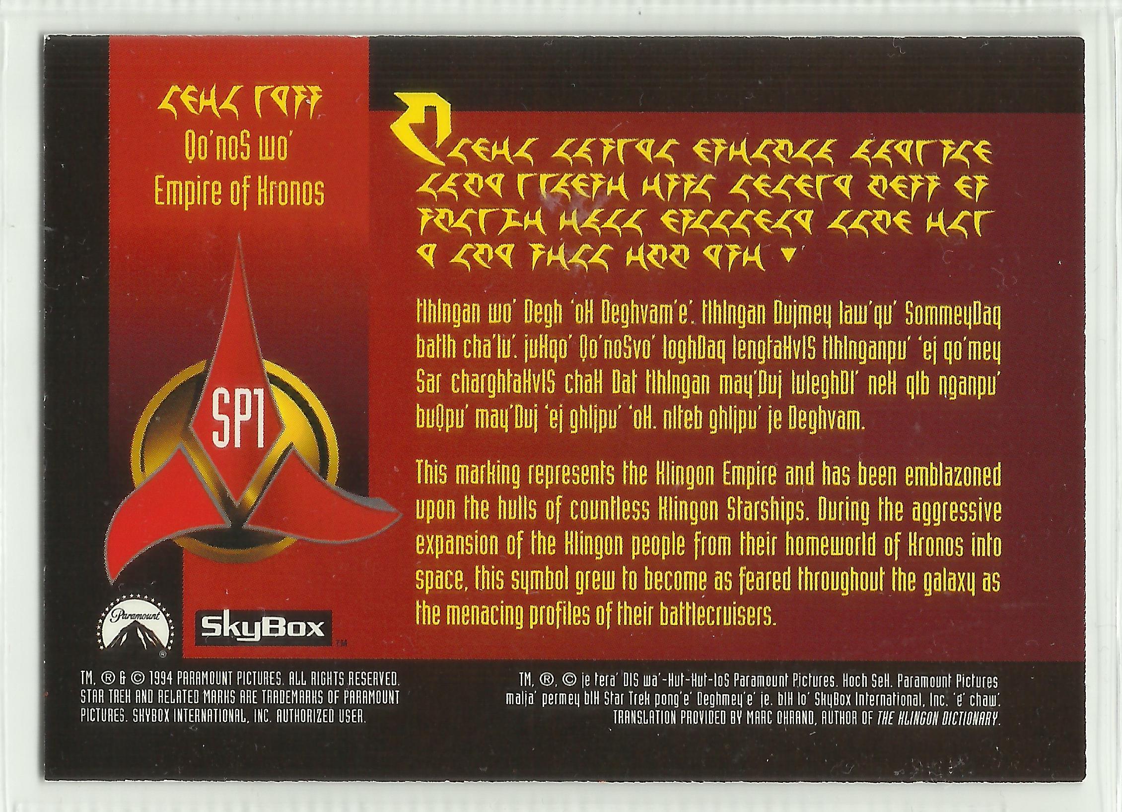
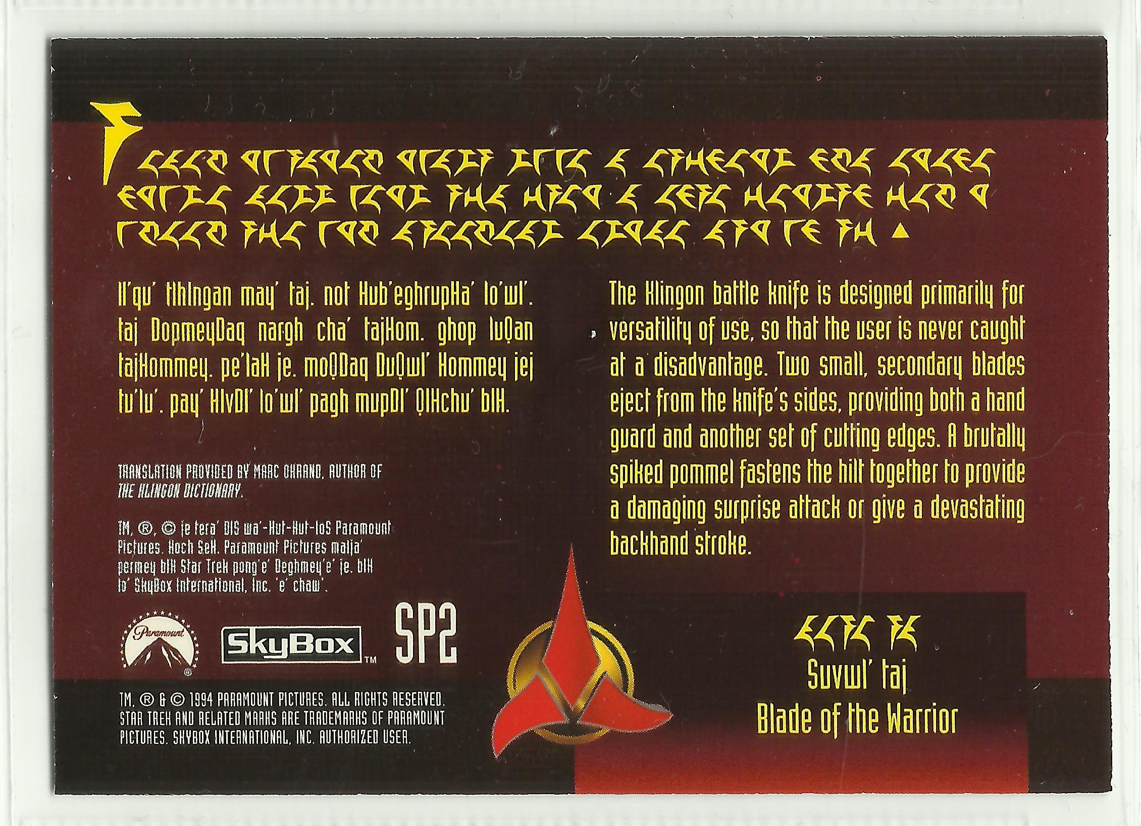
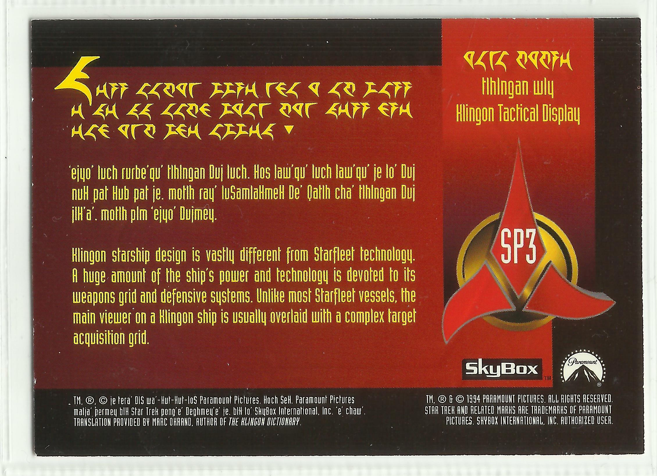
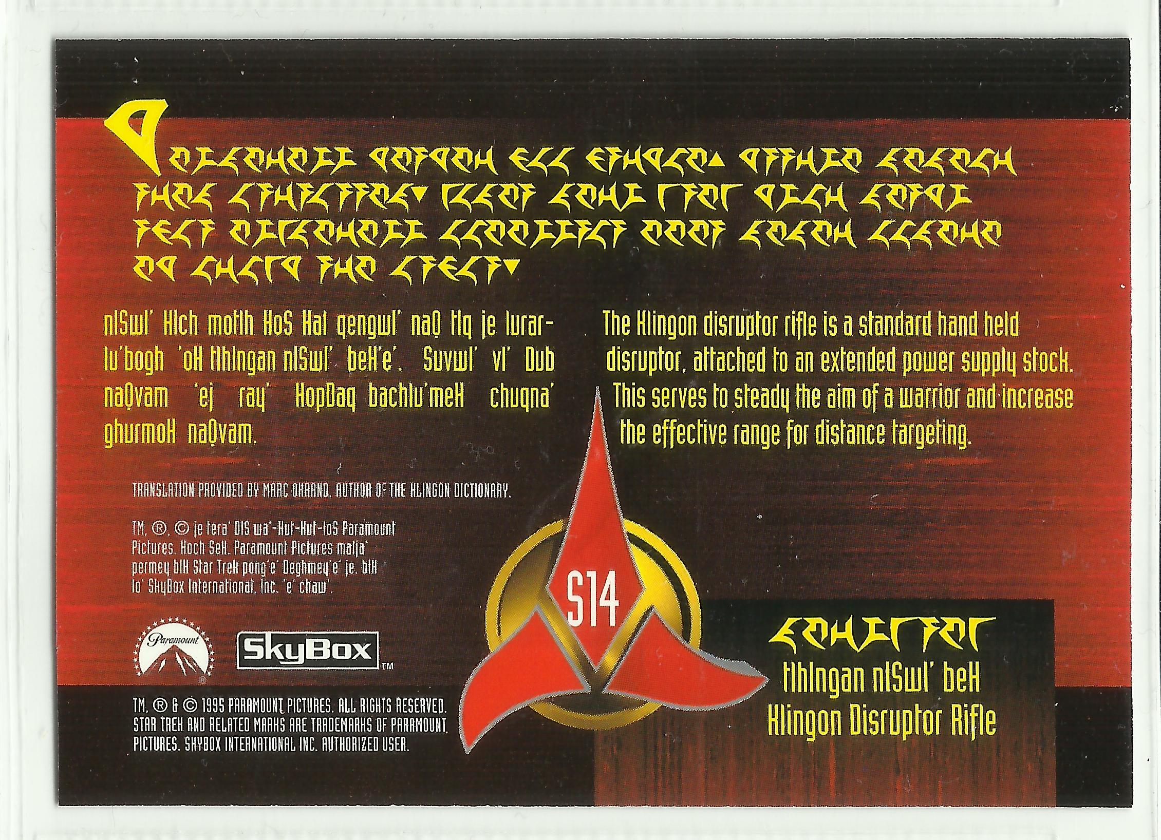
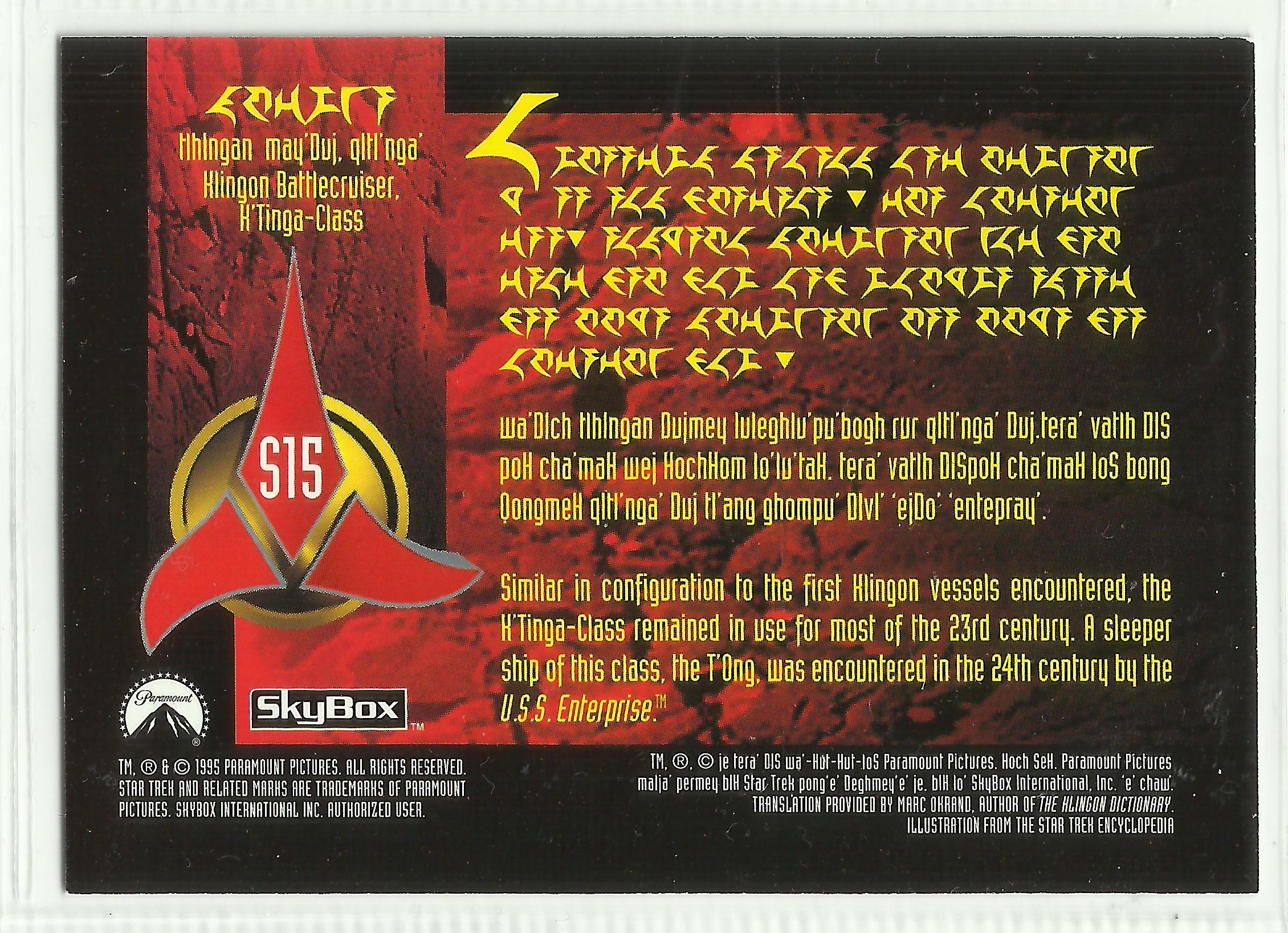
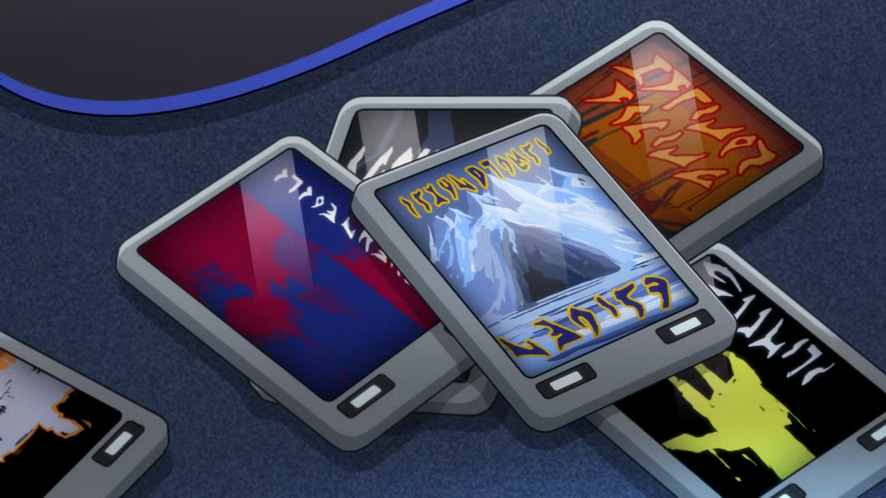
In 1994, SkyBox published the Star Trek collectible
cards SP1, SP2 and SP3.
Each of the cards contains a paragraph of random text written in
the Star Trek Pi font, a snippet of actual
Klingon (written in Latin letters) and an English translation of that text. One
thing is new, however, in that the nonsense text also contain filled black
triangles (either pointing up or down) which looks as if they are acting like
some kind of punctuation marks.
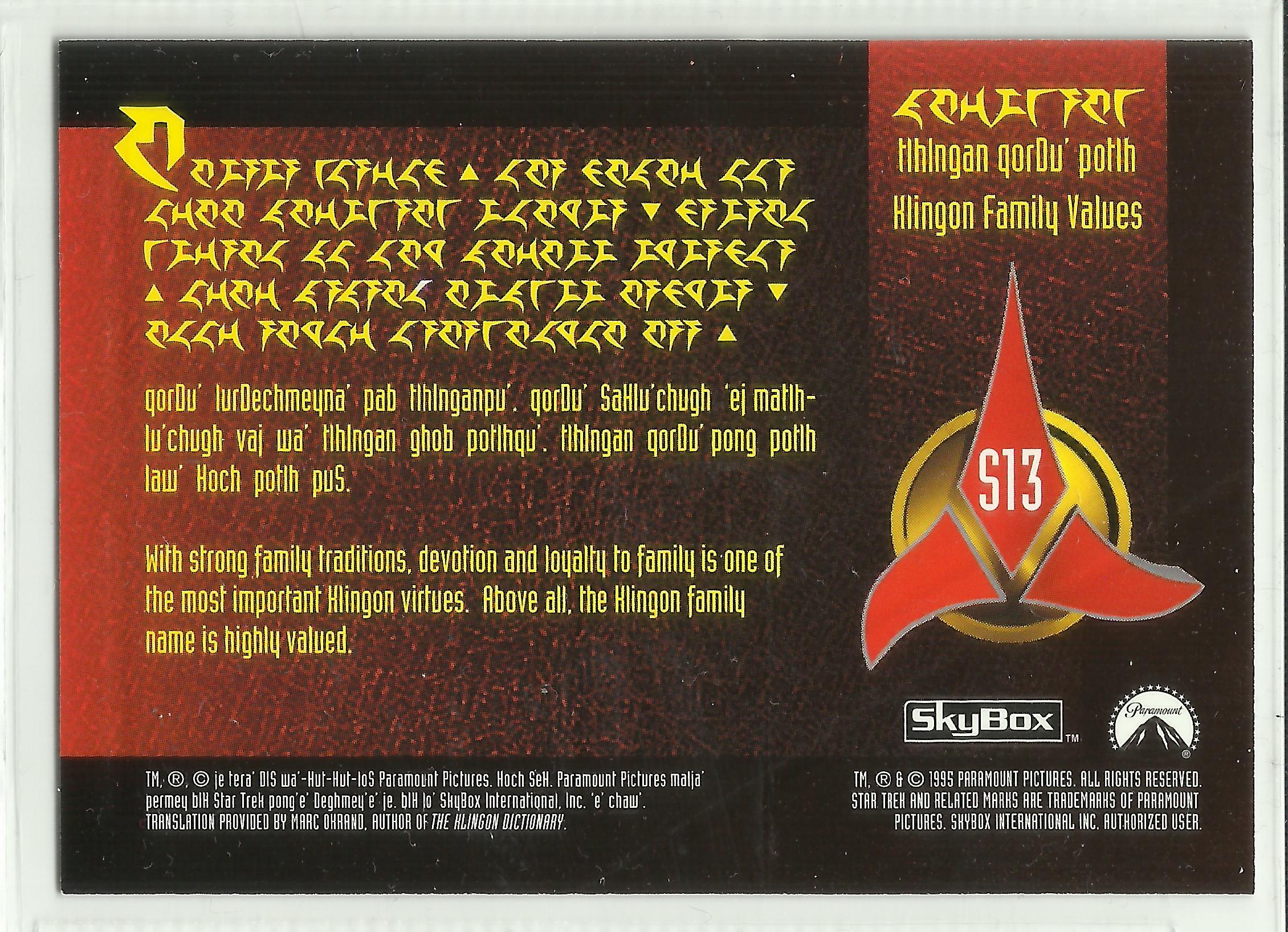
In 1995 and 1996, these cards were followed up with additional cards which
also makes use of the triangles
(S7–S9
and S13–S15 in 1995,
and S19–S21 in 1996).
There were additional Klingon cards published after this as well, but nowhere
did the black triangles reappear.
On most of the cards (though not all) the punctuation triangles are
separated from surrounding words with extra space (written as if they were
words in their own right). I find this neat-looking, since the triangles
themselves are quite heavy on the page.
Entering Canon
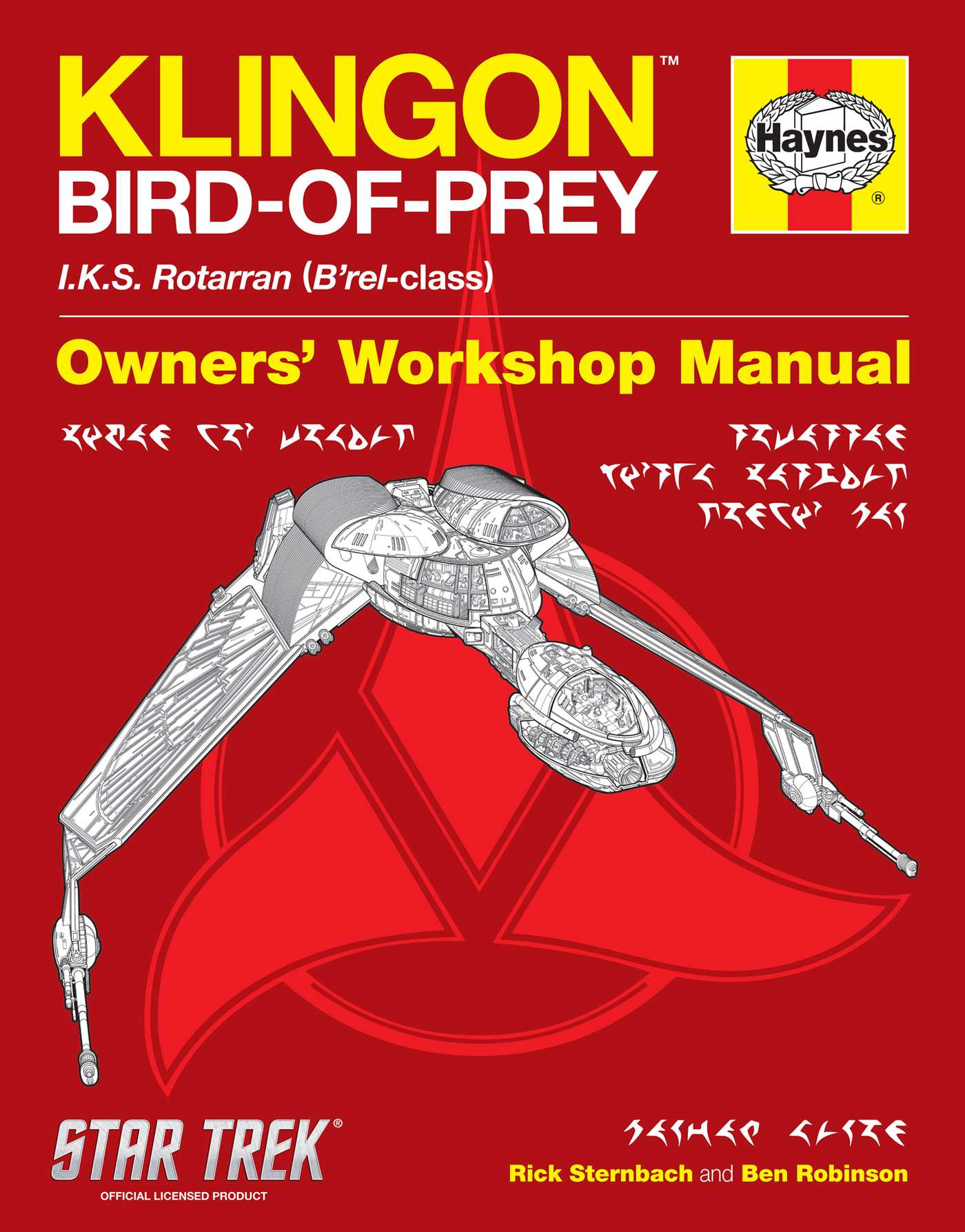
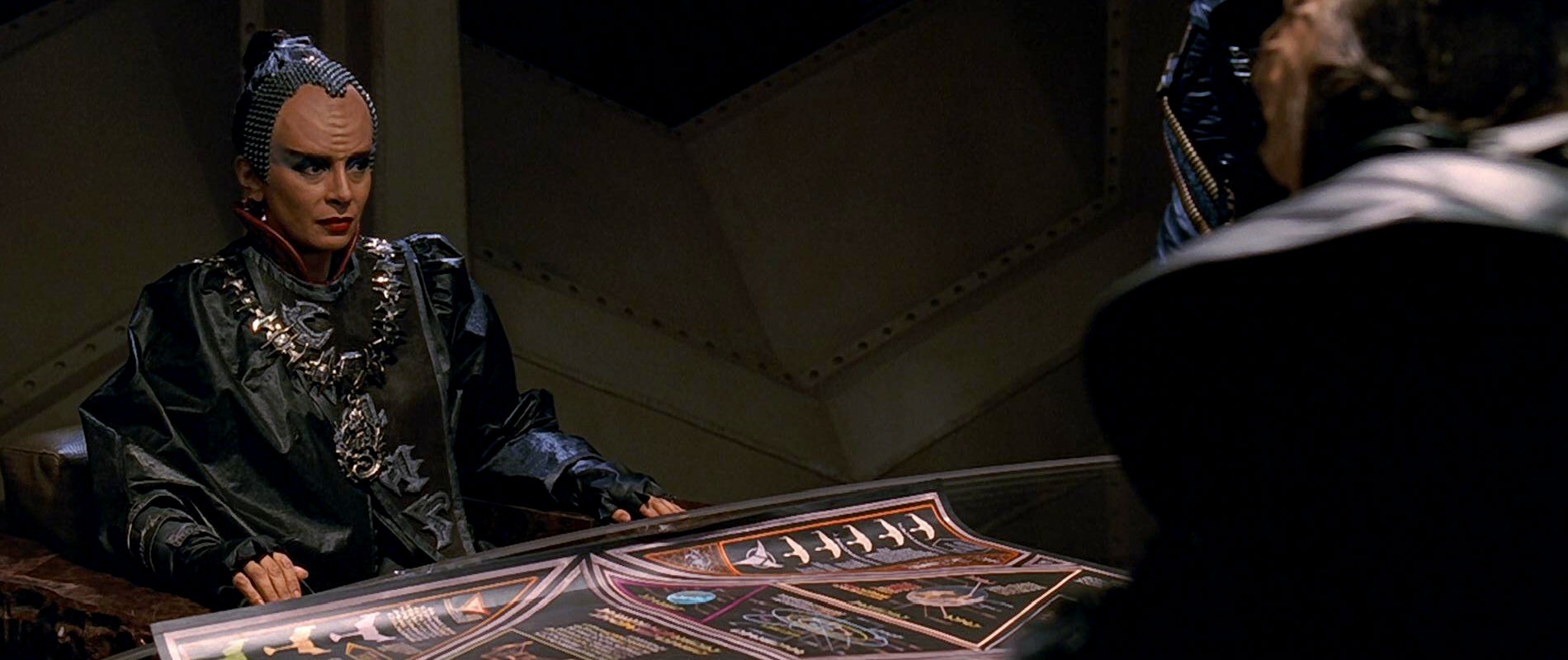
Haynes Bird-of-Prey Manual (2012).
In 2012 Haynes published their Klingon Bird-of-Prey: Owner’s Workshop
Manual, which, among other things contained text written in pIqaD.
And since this is an officially sanctioned, licensed product it meant that the
Klingon writing took another step towards full canonicity. And this time, the
text was genuine and actual Klingon was being written! The fonts used is this
book (pIqaD HaSta
and pIqaD vaHbo’) were designed by Mike Neff (qa’vaj)
and released to the wider world in 2009.
Unfortunately (in my opinion), though the pIqaD HaSta look a
lot more like what we see on-screen than KLI pIqaDmey does, some
of the glyphs are just off, doing their own thing for no particularly
good reason, deviating quite a bit from the pIqaD we got from veS
QonoS.
a
b
ch
D
e
gh
H
I
j
l
m
n
ng
o
p
q
Q
r
S
t
tlh
u
v
w
y
’
0
1
2
3
4
5
6
7
8
9
,;:
.!?
HaSta symbols from Haynes Bird-of-Prey Manual.
Star Trek Pi /
★★★ = nice! /
★★☆ = ugly /
★☆☆ = unrecognizable
Worst in appearance are the vowels e, I, o, and the
consonants j, Q, and tlh (the darkest blue in the table
above)—they hardly even resemble corresponding glyphs in KLI
pIqadmey. A little less bad are b, D, H,
m, S, t, u and w (light blue above), which,
while not exactly aesthetically pleasing, are at least identifiable.
Finally, the a, gh, l, n, ng, r,
v, and y (yellow above) borrow their glyphs from the Star Trek
Pi font (though slightly rounded, loosing the crispness of detail seen on
the SkyBox cards). ch is a clockwise 90° rotated version of ng.
While p, q, and ’ are nicely designed originals.
What Should Good pIqaD Look Like?
Uniform look and kerning.
A font similar to the like signage seen in TNG and similar. The idea is
to follow KLI pIqaDmey as closely as possible, yet also make
the glyphs less amorphous and blobby, and more like a proper writing system.
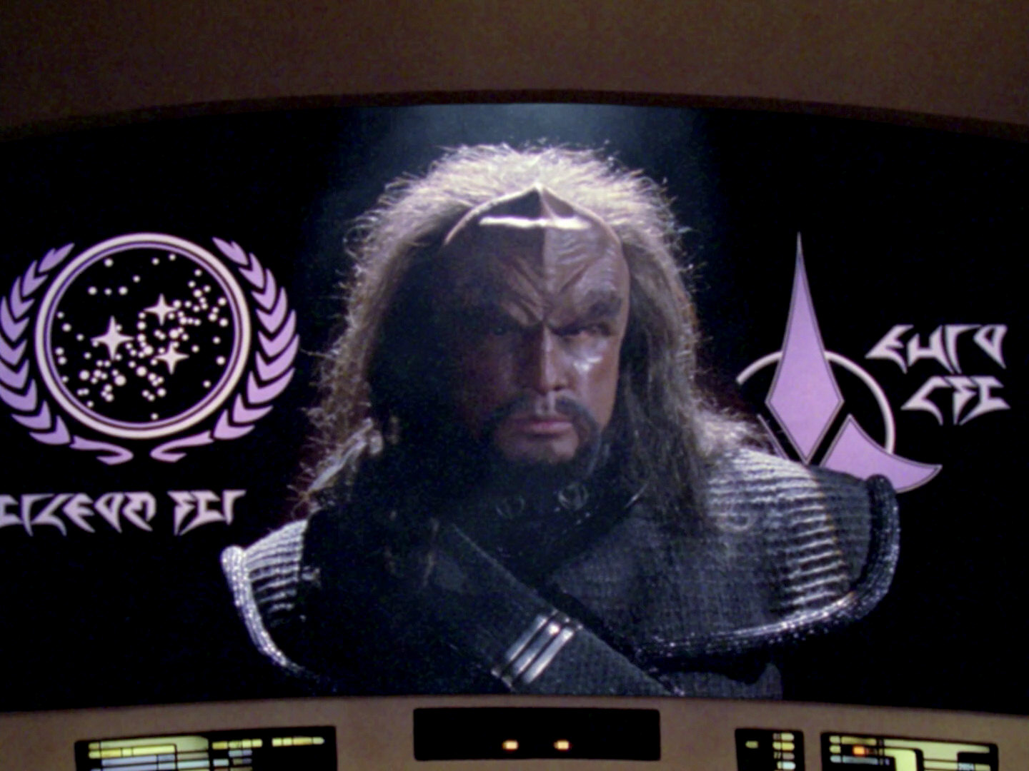
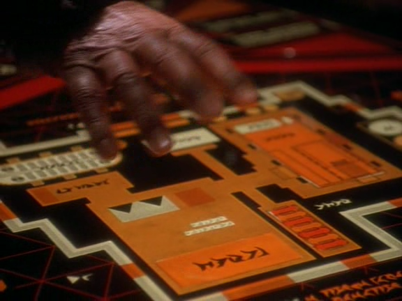
TNG era pIqaD (Star Trek Encyclopedia, 1st ed, 1994).
Retain the fine, crisp details of the font on the SkyBox cards, with very
sharp endings of the strokes. The glyphs below are from the Star Trek
Pi font that came with the official Star Trek Font Pack, and as
far as I can tell these were the glyphs used on the SkyBox trading cards.
Wide spacing surrounding period and comma triangles.
Good visual distinction between problematic characters.
(Especially p, q and Q.)
Glyph alignment accenting the top of the glyphs (i.e. a baseline at the
top from which all the glyphs hang down, somewhat similar to Devanagari).
Glyph-by-Glyph Thoughts
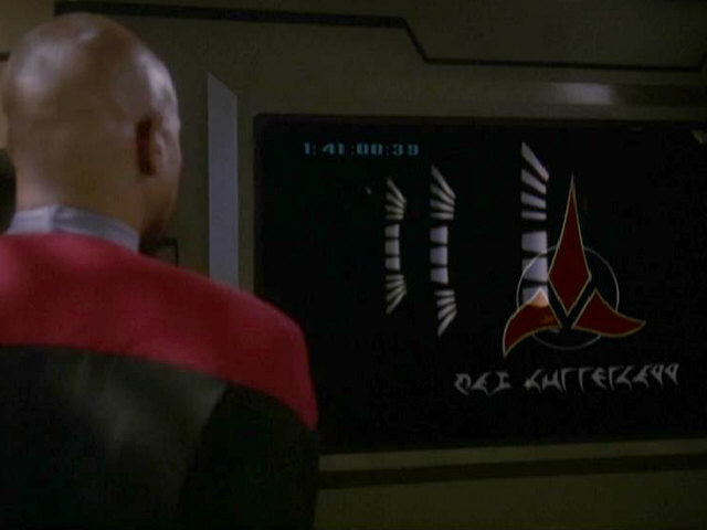
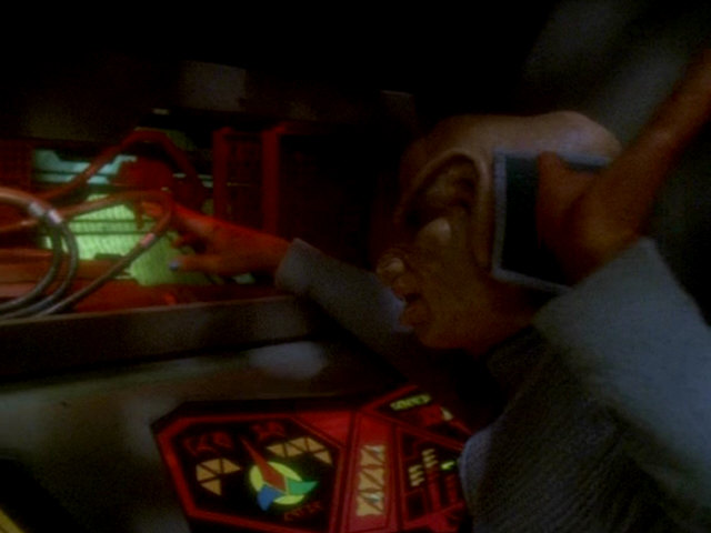
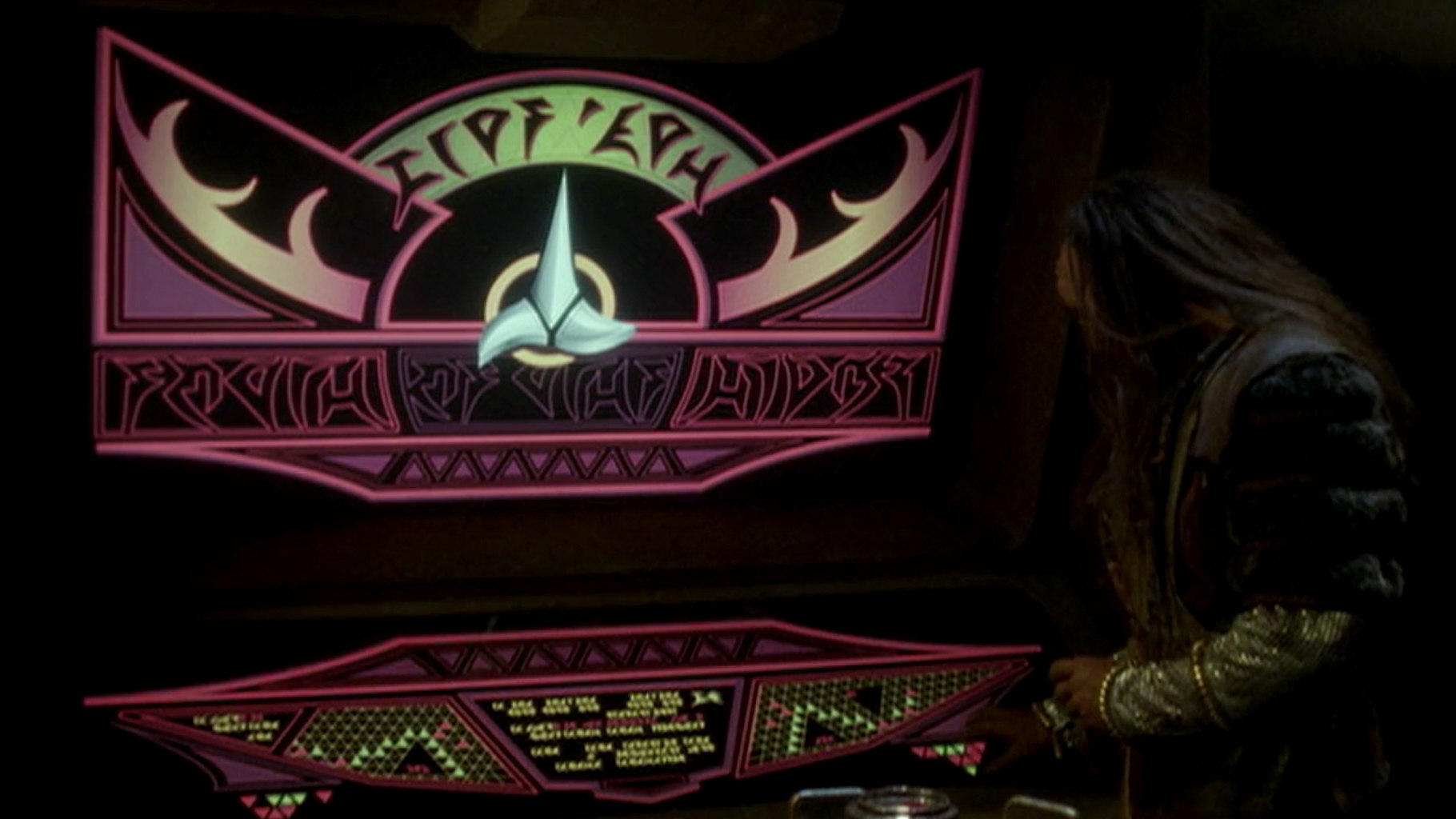
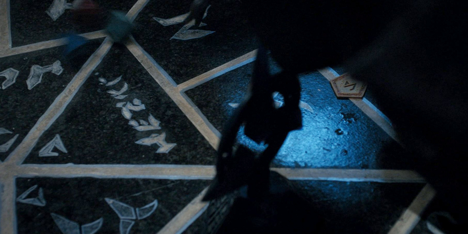
A previously unseen qaghwI’ adorning on-screen signage. Hoshi
helpfully translates this sign as meaning “Deck 2, red sector”. (Star
Trek: Enterprise, episode 1:14 “Sleeping Dogs”, 00:10:21)
Below I use “original pIqaD” to refer to the writing system described
in veS QonoS (which is implemented by the
fonts KLI pIqaDmey, KA-pIqaD, pIqaD by qurgh
and possibly others).
ja – Unmodified Star Trek Pi glyph.
b –
ch – Star Trek Pi
glyph l rotated 90° clockwise, and
stretched somewhat in the length direction.
D – Star Trek Pi
glyph m rotated 180°. A break should be
added in the bottom line, and maybe the top line should be elongated and
slightly bent to the right.
e – In original pIqaD the
glyphs for e and w are quite similar, with the most prominent
difference being that the lines of e do taper but remains the same
thickness all the way to their tips, while w end in sharp edges.
igh –
Unmodified Star Trek Pi glyph.
H – This glyph is significantly smaller
and narrower than all the other glyphs in the original pIqaD, which
makes it look sorta out of place. Is this perceived as a distinguishing
factor among pIqaD users? If this is the case, then I think the
smallness should be preserved, otherwise I’d rather rescale the glyph be more
in line with the size of the other characters.
I –
j –
el – Unmodified Star Trek
Pi glyph.
m –
fn – Unmodified Star Trek
Pi glyph.
lng – Unmodified Star Trek
Pi glyph. The glyph has a stronger downwards line than in
the KLI pIqaDmey.
o –
p –
q –
Q – Some fonts (like pIqaD
HaSta, pIqaD Mandel and Nokia Pure)
use k from Star Trek Pi as the
symbol for Q, but I think this less than ideal. The only real reason
for using both kande that I
can see, would be that, since both glyphs have been established as on-screen
canon, they both need to be included in the typeface for it not to contradict
on-screen canon. And though I actually find this a quite compelling argument,
I simply think that readability is more important. Also the Q found
in veS QonoSpIqaD looks very different
( vs k).
gr – Unmodified Star Trek
Pi glyph.
S – Use a modified version of one of the
glyphs from gunner controls in Star Trek: The Motion Picture?
t – Vertically flipped
version of 6.
tlh –
u –
hv – Unmodified Star Trek
Pi glyph. It is worth noting that the Star Trek Pi glyph looks
quite different from the original pIqaD
(h vs ).
nw –
Unmodified Star Trek Pi glyph. In original pIqaD the glyphs
for e and w are quite similar, with the most prominent
difference being that the lines of e do taper but remains the same
thickness all the way to their tips, while w end in sharp edges.
my –
Unmodified Star Trek Pi glyph.
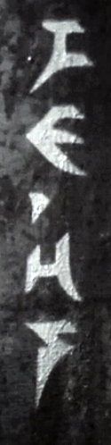
’ – Use
the glyph that occurs in signage in the Star Trek
Enterprise episode “Sleeping Dogs”.
0 – I think this occur on a
secondary display on the Klingon bridge in Star Trek: The Motion
Picture, though unfortunately there’s a lot blur, so that probably won’t
help much in defining the shape of the glyph.
1 –
2 –
3 –
4 – Use glyph from original series D7
batteship by Matt Jefferies? Unfortunately the Mandel
script have different proportions, line widths and angles. So this still
requires a manual redrawing of the glyph.
5 –
6 – Vertically flipped
version of t.
7 –
8 –
9 –
,;: – This downward pointing triangle
should be moved slightly down (for optical balance).
.!? – This upward pointing triangle should be
moved slightly up (for optical balance).
c¶ – Unmodified Star Trek
Pi glyph.
Font Comparison Chart
The following pIqaD comparison chart, is intended to illuminate
different people has interpreted the different glyphs, and what the perceived
common denominators are. For example, I think that short break in the lower
part of line of the letter D is an important distinguishing feature, and
by looking at the font comparison table we can see that most (though not all)
font creators seem to agree with this as they have retained that feature,
giving my reasoning some extra strength.
Included in the table below are all Klingon pIqaD fonts I’ve been
able to find. Fonts are taken from, among others,
the Klingon.Wiki page
“Klingon Computer Fonts” and the
Finnish Klingonia site’s
“Comparison of pIqaD fonts” (in
Finnish). In the cases where I have been able to find a web page for the
original font, the font name links to that site, in the remaining cases I
instead link to a place where the font is used. Hover over a line in the table
to get the name of the creator.
Longhand interpretations should be added to the below tables as well.
Fonts to add above:
⬤ Both pIqaD versions from veS QonoS.
⬤ Klingon Font (xifan-hol)
⬤ KlingonTNG (xifan-hol)
⬤ Zigan Trad (xifan-hol)
Font Info
Nokia Pure Headline Klingon (2013) is a classical sans serif
typeface created by the font foundry Dalton Maag (commissioned by Nokia). It
adds Klingon characters to the Nokia Pure Headline font. It was
published as an April Fool’s joke in 2013, but is still one of the most
complete fonts out there with regular, bold and light variants
(Nokia:
“Pure Klingon”, 2013).
Episodes
This is a list of Klingon-centric episodes (episodes with only series
regulars Worf or B’Elanna are not included). The list is meant to serve as a
continuation point for further research (and screen captures) relating to how
Klingon writing has been portrayed on-screen in Star Trek. It has been
compiled from the list of episodes mentioned on Klingon.Wiki’s
“List of Klingon Star Trek
Episodes” as well as the Klingon episodes mentioned in the Memory
Alpha article
“Depicting
Klingons”. The list (as well as this whole article) should not be
regarded as complete, and additional movies and episodes will most likely be
added to it in the future.
The first column indicates whether or not I’ve gone through the episode and
captured relevant image (“✓” for a researched, and “✗” for one where research
has yet to be done). Lack of screenshots for an episode I have watched
does not necessarily mean that Klingon writing does not occur, only that
nothing new and/or interesting occurred (i.e. if only Star Trek Pi
glyphs occurred). In the cases where there are screenshots for an episode I
haven’t gone through, these screenshots are often images I’ve randomly stumbled
upon in other sources. The list is sorted in airdate order.
The pangram, qajunpaQHeylIjmo', batlh DuSuvqang charghwI' 'ItBecause of your apparent audacity, the depressed conqueror is willing to
fight you with honor, which is used above to illustrate fonts, was created
by Agnieszka Solska (also known as 'ISqu') and was the winning
contribution to The Great Pangram Contest in HolQeD 10:4
in 2001.